|
|
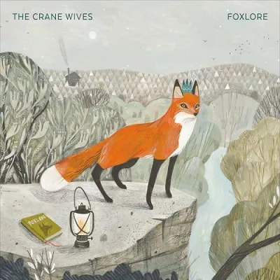
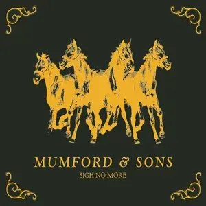
For my brief, which is to create three album cover designs, I first decided to look into album covers by The Crane Wives, and other folk bands such as Mumford and Sons to see what aspects i could borrow for my own album covers. I really like how the covers were very illustrated, but unfortunately it didn't fit with the 3d aspect of the project so I didn't take much inspiration from them.
|


After gaining some feedback from my tutors, I went out to the Vinyl Café and looked at the collection of vinyls there, which helped me understand what an album would look like. I ended up buying 3 that I liked the look of, shown below.
|
|
I really liked this album cover because they were both illustrative with the framing of the pictures and borders and kind of 3d with the photography. I also really liked the colour pallette, especially combined with the photographs being vintage.
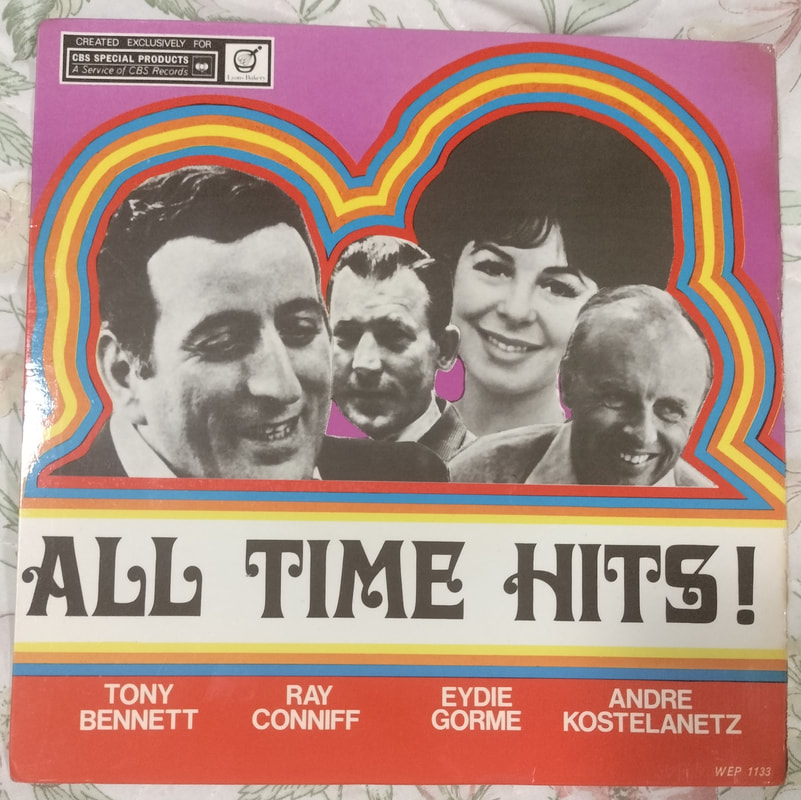
I picked this single cover because i really liked the contrast between the black and white images with the very colourful background and outlines, and it was very appealing to me. The back of the single album is really boring looking though, which i dont really like much.
I picked this album cover because of it having photography, although I think the colour used for the text makes the text quite hard to read. I also really liked how the back of the single was the same purple as the text, and especially liked the images on the back of the single.
|




|
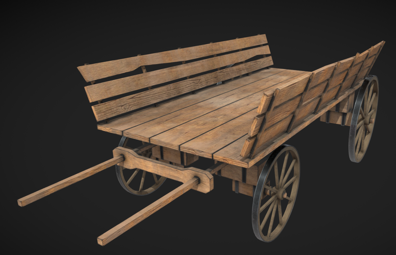
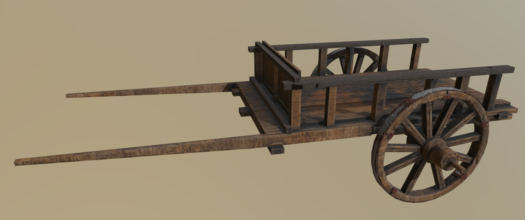
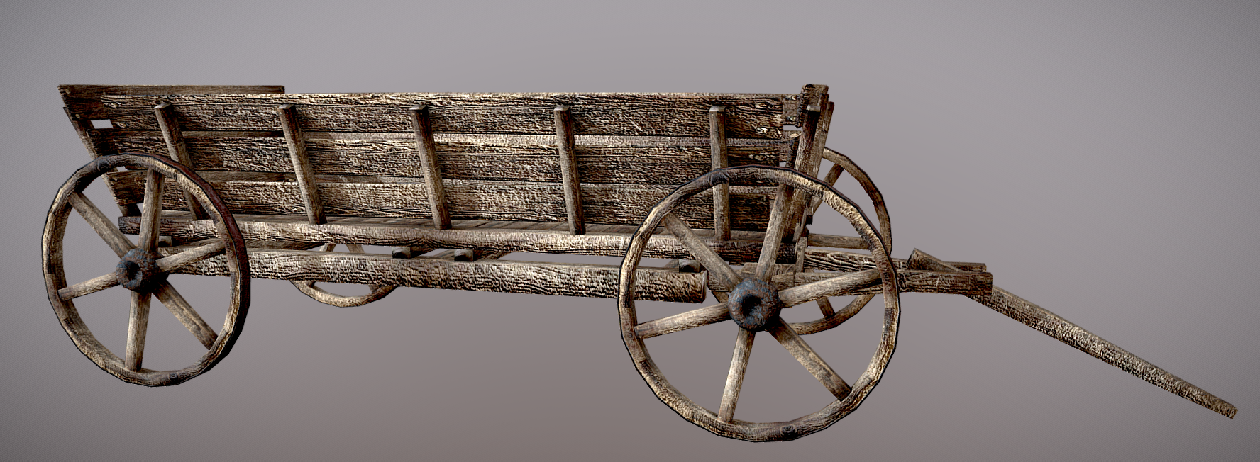
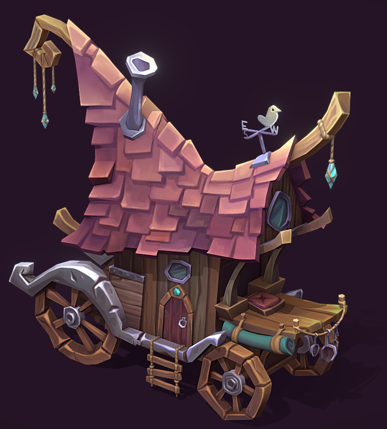
click the images to go to the 3d model!
|
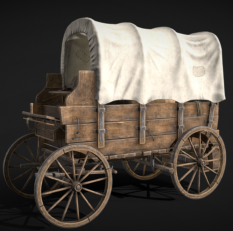
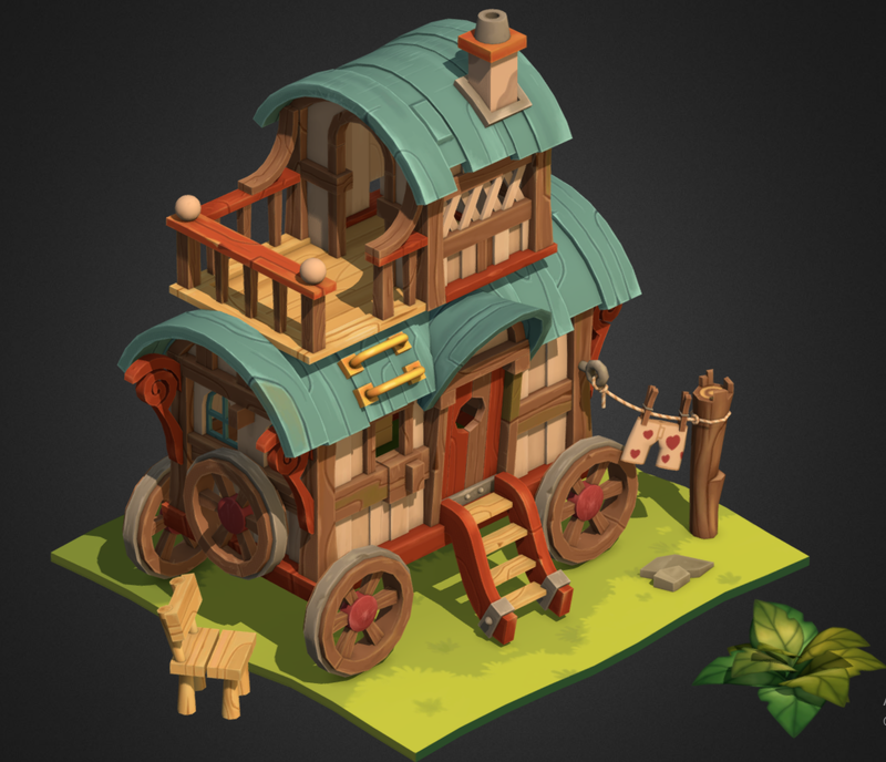
I also decided to look into how model carts are made as well, to help me build my clay cart. This was very helpful to figure out both how the carts work and gather inspiration for the design of the cart! I used 3d models from sketchfab for reference, which i find a lot more helpful than a static image.
|