
|
My first animation test using clip studio paint. I was inspired by the Omori style for the animation, by having it be mostly eight frames a second with looping frames outside the eye movement, which was a lot quicker and unique movement.
|

|
Another unfinished animation test with an original character of mine, also animated using clip studio paint and inspired by Omori's style, although I looped the frames quicker.
|
|
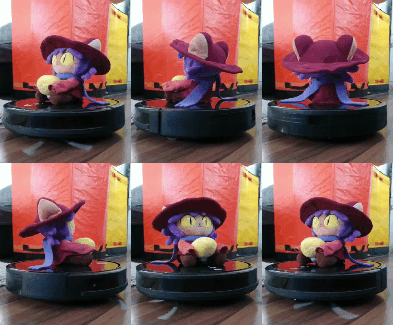
I also tried rotoscoping my original character onto a gif of the character Niko from oneshot, as shown. I used clip studio paint again, and found this process more fun than hand animating, even if it looks wonky. I rotoscoped on twos.
|


I then moved on to making the first rough draft of the animation, made to help me plan out what i want for it. This was cut down significantly during the process of actually animating.
|
|
I decided to try using an editing program called Hitfilm to animate cart wheels. This didnt work out as well as I hoped, unfortunately.
|
 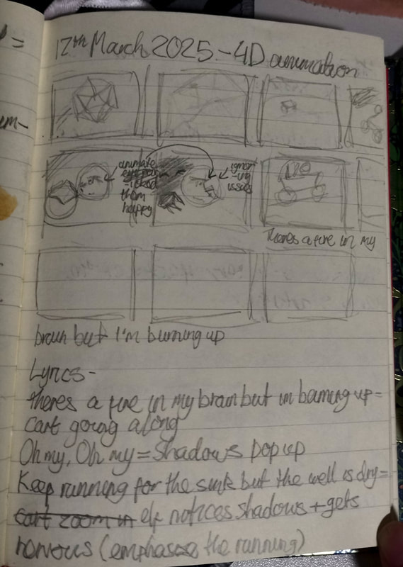   |
My planning for the animation. I struggled to storyboard the animation, so I resorted to writing out my plans. I found this a bit easier than storyboarding.
|
Character Designs


|
My character designs for the animation. For the shadow character, I was heavily inspired by Something from Omori. The witch design was quite difficult for me to get right, as I had to do two versions.
|

|
|
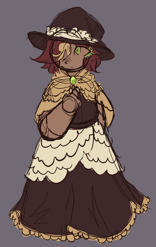
The old witch design. I changed the design because it felt too childish, and i didnt like the colours. I kept some aspects in the redesign, such as the gem and cloak.
|
|