Logo and Merch Concepts
Logo Design
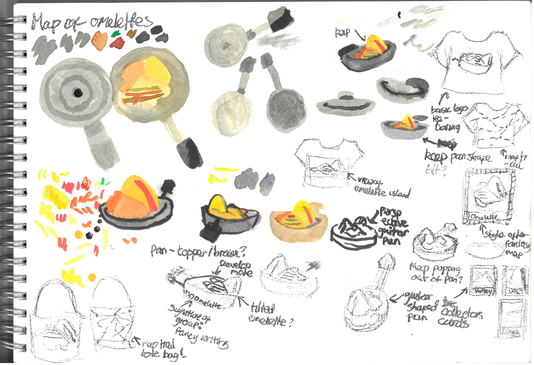
For the logo, My first thought was to make an omelette island, so i experimented with that. I then got some feedback and from that got the idea of using a frying pan to hold the omelette, so i experimented with different angles and concepts. I found that the frying pan took away from the omelette island idea and was the focus, so I looked into having the omelette on a spatula instead. For the omelette on the spatula, i liked the concept but it felt too long and one sided design wise so i scrapped the idea.
Below are my initial sketches and ideas development.


|
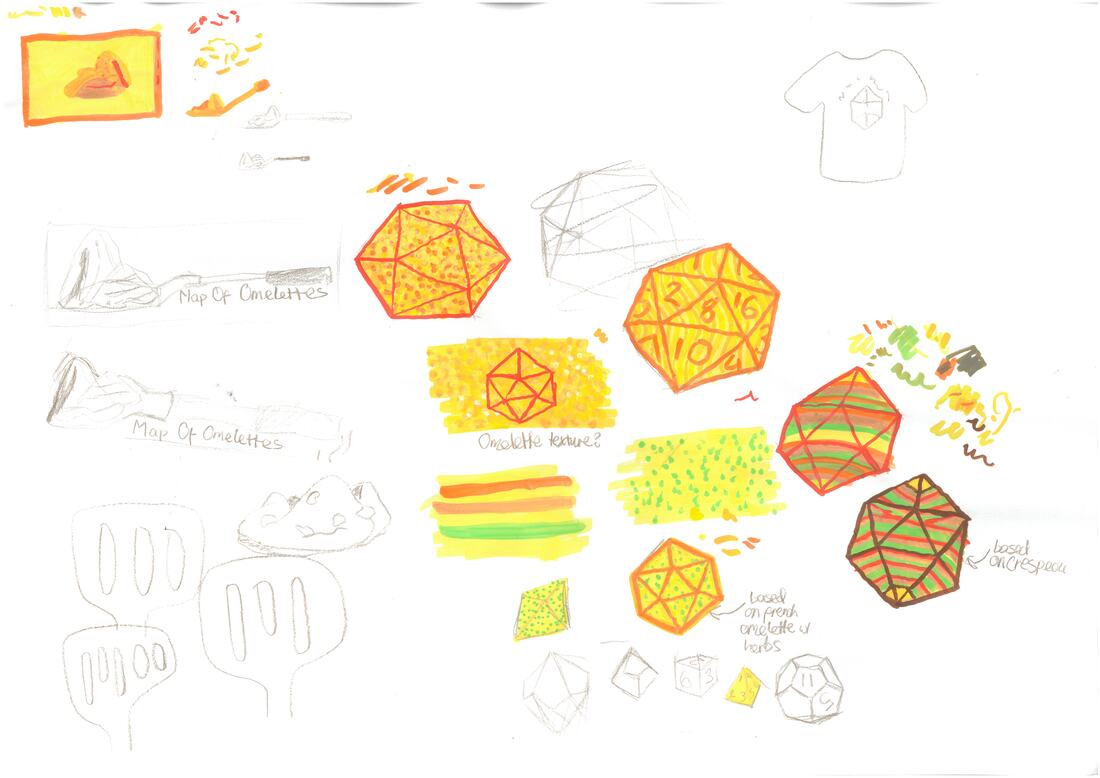
When designing my logo, I had the thought of using digital collage (as in making the omelette textures physically and digitally putting them together. I went through a lot of designs before i felt it was right (as shown in the timelapse).

The textures i made using acrylic markers that resemble omelette textures. They are supposed to resemble ketchup, French Omelette, Crespéou and Regular Omelette.
|
|
Merch and Poster Design
|
For merch, my first thoughts was to make the standard shirt that everyone would think of when they hear the word merch, but I also wanted to look into other options as I think just doing shirt designs is really boring.
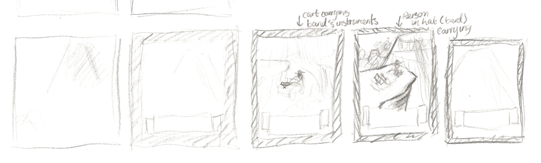
I looked into different merch ideas that related to food in some way (such as branded plates or spatulas) and although I liked those concepts, I also wanted to make something to do with the "map" part of the band name, as in my head the band is a dnd group's campaign but made into a band. For my poster, I was inspired by fantasy maps. I decided that each gig poster would be an illustration of a place in the omelette world, such as Crespéou Valley, or Omurice Volcano. I think that this was the right way to go about it, but I struggled with making the text on the poster readable in an interesting way (which i ended up not adding). If I were to redo this project I would work more on the poster to figure out where to put the text needed for the poster. |
|